Tuesday, April 25, 2017

Soil Health Survey: ArcCollector Part 2

Nathan Sylte
4/25/2017
Soil Health Survey

Introduction:

The objective was to use the geographic inquiry process to conduct a study. The geographic inquiry process involves developing a geospatial question. Then, relevant data is collected and analyzed to answer the question. Our task was to generate and deploy a geodatabase with domains to ArcCollector. It should be added that the proper usage of geodatabases and domains is critical when collecting data. Data would then be collected in the field using ArcCollector to answer a geospatial question. 

Specifically, the geospatial question that came up was , "Are the soil homogeneous throughout the UW-Eau Claire campus?" 
To answer this question different soil measurements and observations had to be made. In this case, soil PH, moisture, and grass appearance were used to determine the consistency of the soil throughout campus. Grass appearance does not necessarily correlate with soil health. However, healthy grass has a certain aesthetic appeal to it so it was included in the data collection. 

As previously stated, the study area for this project will include the UW-Eau Claire campus. The campus of the University of Wisconsin Eau Claire is fairly diverse with the campus being divided into an upper and lower section. There is also a very heavily forested area and hill dividing upper campus from lower campus. This area is part of Putnam Park. Upper campus is primarily comprised of dormitories, while lower campus is mainly made up of academic halls. Lower campus also extends across the Chippewa River with a walk bridge connecting the two parts of lower campus. Throughout campus there are several large open areas. These large grass open areas are where the data will be collected. The smaller patches will not be touched. 


To view the study area check out the embedded map below.


Also, view Figure 1 to see the zones where the soil data were collected in. 

Figure 1. Different zones where the soil data were collected shown outlined in red. 

Methods:

Before any data collection took place a geodatabase for the project with domains was created so the project could then be deployed to ArcCollector. For this study three domains were created. Moisture, PH, and grass health comprised the three domains that were created. In the geodatabase for the soil health project a soils feature class was created. This feature class contained three fields. These fields included moisture, PH, and grass health. Moisture and PH were both set to float and grass health was set to text. Grass health included three different categories which included excellent, moderate, and poor. These three attributes were to be determined based off the appearance of the grass.   

After the geodatabase was set up, the project was deployed to ArcCollector by following the create and share a map tutorial on ArcGIS Online (ArcCollector Project). 

Once the project was deployed to ArcCollector, data could then be gathered. This involved going out to the different grass sites with a hand held meter that collected moisture and PH. The overall health of the grass was also observed. Points were taken at intervals so that a good portion of the zone would be covered. Following the collection of soil data, maps showing PH, moisture, and grass appearance were generated. 


Results/Discussion:

There were several interesting finds after analyzing the data. First, there were several locations that were more acidic than expected (Figure 2). The grounds crew regularly maintains the grass/grounds therefore a neutral PH was expected to be present in the soil throughout campus. One of these acidic locations included the large grass area just west of the Haas Fine Arts Center. Another location that proved to be more acidic than expected was the grass area just north of the Nursing Building. It should be added that soil that contains a PH of lower than 7 is considered acidic. However, a PH of 5 to 6 is not considered a strong acid. All together, a good majority of the soil had a fairly neutral PH. This is representative of the work that the grounds crew does to maintain the campus yards. 

There were many inconsistencies with regards to soil moisture levels throughout campus (Figure 3). Certain areas such as the yard to the north of the Nursing Building possessed a very high level of moisture. Meanwhile, areas such as the yard west of Towers Hall and the grass area north of Davies Center were very dry. These areas also received a poor to moderate grade as far as the grass health observation (Figure 4). The likely cause for the poor to moderate grass health grade and the low levels of soil moisture would be the fact that these areas receive a high amount of foot traffic. This foot traffic can destroy the grass and decrease the grasses ability to hold moisture. It should be added that there was an area with a high amount of moisture and very poor grass. One of the yards to the north of the Nursing Building had very poor grass and extremely high moisture. It is possible that the grass there is receiving too much moisture. 
Figure 2. Soil PH represented in shades of red. IDW interpolation method was used to map PH. 

Figure 3. Soil moisture shown in shades of red and blue. IDW interpolation method was used to map soil moisture. 
Figure 4. Grass health observation map. Healthy grass shown in green, while unhealthy grass shown in red. Grass health was assessed based on appearance of the grass where healthy grass was the most green and thick. 


Conclusion:

To answer the geospatial question of "Were the soil homogeneous throughout the UWEC campus?", the conclusion can be made that the soil is in fact somewhat heterogeneous throughout campus. Although there are many locations where the soil quality is very similar, several locations held different qualities. Though the differences in soil health were not extreme, the grounds crew may want to attend to several areas throughout campus. One of these areas includes the yard west of Towers Hall which needs to be watered and re-seeded. 

Once again ArcCollector proved to be very useful and applicable (view previous blog for more ArcCollector uses MicroClimate Survey). This soil health project and the micro climate survey from the previous week demonstrate ArcCollectors usefulness. The next step to the soil health project could be to create an web application that could be used by the grounds crew and people traveling about campus to monitor the campus grounds. This would be done by using web app-builder for ArcGIS. Overall, the lab proved to be very useful in further developing the ArcCollector skill. 


Tuesday, April 11, 2017

Microclimate Survey: ArcCollector Part 1

Nathan Sylte
4/11/2017

Microclimate Survey 

Introduction: 

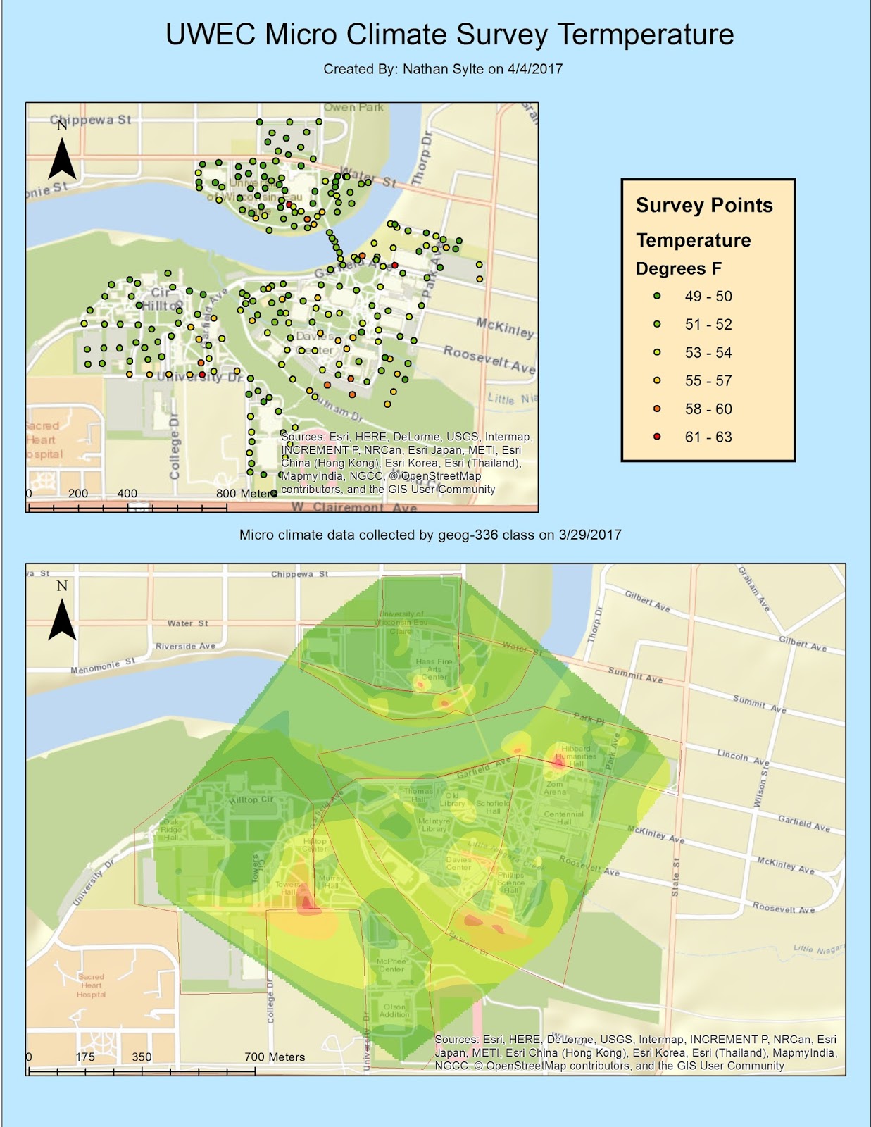
The objective of this lab was to become familiar with ArcCollector by conducting a microclimate survey of the campus at the University of Wisconsin Eau Claire. A microclimate survey simply analyzes the different environmental conditions around lower campus. In this instance temperature, wind chill, dew point, wind speed, wind direction, and humidity were measured as climate variables. The survey involved the entire class collecting climate data at once with the use of ArcCollector on the individuals smart phone. 

The campus of the University of Wisconsin Eau Claire is fairly diverse with the campus being divided into an upper and lower section (Figure 1). There is also a very heavily forested area and hill dividing upper campus from lower campus. However, the two sections of the campus are fairly homogeneous when compared with themselves. Upper campus is primarily comprised of dormitories, while lower campus is mainly made up of academic halls. Lower campus also extends across the Chippewa River with a walk bridge connecting the two parts of lower campus. This walk bridge is often described as the "coldest place in the lower 48 states", and should present different data than the other parts of campus.The primary goal of the microclimate survey was to investigate and compare the different climatic conditions between the upper and lower campus sections. 

There are several advantages of using ArcCollector to gather field data, as well as some disadvantages. One of the primary advantages of using ArcCollector is that it can be installed on anyone's smart phone. The application is also very cheap which adds additional flexibility to ArcCollector. Another advantage of ArcCollector is that multiple people can use the application at once. If an organization needed to collect quantities of broad data all at one time then ArcCollector should be considered as an option. One disadvantage of ArcCollector on a smart phone is that the cell phones built in GPS is not as accurate as a survey grade GPS unit. This adds limitations to the type of projects one may use ArcCollector to perform. If a high grade of GPS accuracy is required for the project then an additional method other than ArcCollector should be utilized. 

Figure 1. The campus of the University of Wisconsin Eau Claire. The red lines represent different survey zones. The different regions of the campus are labeled in black. 

Methods:

Before the survey took place the project was first deployed to ArcGIS Online and then to ArcCollector. Also, a pre-created geodatabase was entered into ArcCollector. This geodatabase contained the necessary domains and feature classes required for the survey. These steps were performed in ArcGIS Online by logging into the UWEC enterprise account. The project/basemap had to also be shared with other UWEC members to allow for collaboration.Another step the class had to perform before completing the survey involved downloading the ArcCollector application on their smartphones. This would allow the individual to collect and share data with other members of the class.  After the survey took place the geodatabase could then be brought into ArcMap, and the data could be analyzed and mapped. Another option was to map the data in ArcGIS Online and then publicly share the maps. This option was not used in this particular project but will be used in the next lab.

The survey methods are below. 

First, the campus was divided into different zones to insure the class was evenly distributed throughout campus (Figure 1). Each individual that participated in the survey was assigned a zone and hand held device that could measure temperature, wind chill, dew point, wind speed, and relative humidity. Wind direction was measured with the use of a hand held compass. The individual was to collect data from 20 different locations within their assigned zone (Figure 2). 

Figure 2. The location of each survey point collected with the use of ArcCollector. Look to figure 1 for additional reference and comparison. 

 Results/Discussion: 

Maps of temperature and wind speed/direction were generated in ArcMap to represent the different micro climates throughout campus. Temperature was fairly homogeneous throughout campus (Figure 3). However, there were several hot spots located throughout campus. The average temperature on March 29 (survey date) was between 49 and 51 degrees F. This was around ten degrees cooler than the temperature at some of the hot spots. The largest hot spot was located on upper campus near Towers Hall which is a dormitory. These hot spots are created from the warm air leaving certain buildings via exhaust. The exhausted increases the temperature several meters away from the hot spot and dissipates over a relatively small distance. 

Wind speed/direction varied throughout campus. There are many factors that could have altered wind speed and direction. One of these factors is the time at which the reading was taken. The wind speed/direction could have easily changed depending on the time. Another factor that can influence wind speed and direction in this case includes the layout of the buildings. The buildings can block and vector the wind. Overall, the greatest wind speeds recorded were on the walk bridge (Figure 4). March 29 was not a particularly windy day with an average wind speed of less than 5 mph. However, on the walk bridge a wind gust of 33 mph was recorded. Other gusts between 5-7 mph were also recorded on the bridge. This is indicative of the un-sheltered nature of the walk bridge. This high amount of wind also contributes to the cold temperatures often felt on the walk bridge. 

Wind direction was very heterogeneous throughout campus (Figure 4). This has to do with the layout of the buildings that hinder and vector wind in certain areas. The wind direction on the walk bridge which is in a very high/open area had the wind coming from the South/SouthEast. This is likely indicative of the true wind direction on March 29. 

Figure 3. Interpolation map of temperature throughout the UWEC Campus. 

Figure 4. Map of wind speed and direction. Wind speed is represented by colored dots with the highest speed shown with the darkest dots. The arrows are pointing in the direction the wind is blowing. 

Conclusion:

ArcCollector proved to be a very interesting, flexible, and useful application. For surveys like the microclimate survey ArcCollector should be considered as method and application for collecting data. ArcCollector also demonstrated that a large quantity of participants can all work on collecting data at once, henceforth collecting a large volume of data. The next lab which also involves using ArcCollector should prove to be very interesting and applicable.  


Tuesday, March 28, 2017

Distance Azimuth Survey

Nathan Sylte

Azimuth Tree Survey

Introduction:

A common method used in surveying involves the collection of distance and azimuth measurements from a certain point. The distance azimuth surveying method provides an extremely versatile way to collect data when other methods and technologies fail. Preferably, the distance azimuth method involves two people with one person stationed at the starting point. The starting point is where the azimuth is measured (degrees). The distance to the desired object is also measured. Essentially, a standard point is created (starting point), and all the other survey points are measured based off of the standard point. This insures that the survey area is portrayed accurately. The methods versatility arises due to the fact that this method can be performed anywhere under any conditions.

Study Area:

The distance azimuth survey took place along Putnam Drive in Putnam Park on the campus of the University of Wisconsin Eau Claire. Specifically, the general location of the survey was the stretch of Putnam Park directly south of Davies Center (Figure 1). This area is not uniform in forest type and elevation, with the area possessing two general habitat descriptions. Part of the study area is lowland and is generally wet year round. Therefore, the types of trees that grow in this area are different from the higher ground and ridge area which makes up the other part of the study area. The frozen ground allowed for easy surveying so the lower area was selected as the primary survey area. The ridge area was not selected because the frozen ground made for difficult sampling. For the sake of time the lower area was selected. The outline of the ridge can be seen in (Figure 1).

Figure 1. Shown above is the study area where the distance azimuth survey took place. UW Eau Claire lower campus is on the north side of the image (top side). 

Methods:

To begin the survey using the distance azimuth method a starting location at each site was chosen. This would be the designated spot where the distance and azimuth measurements where taken from.Trees where then selected and the distance was recorded from the starting point to the tree. Multiple devices where used to measure distance between the starting point and the tree. One method involved measuring tape while the other method involved remote devices such as the Sonic Combat Pro device. This device involved a receiver at the tree that was to be sampled while a person held the device at the starting location (Figure 2). The Sonic Combat Pro emits a sound wave to measure distance. To measure the azimuth one method involved a hand held compass that involved looking into the device to get a visual of the azimuth (Figure 3). The other methods involved remote devices such as the True-pulse 360B device (Figure 4). This device is similar to a range finder however it contains other options such as the azimuth option. To use this device one must simple aim the device at the desired point. Next,  the circumference of the tree was measured in centimeters.

After the data were recorded and normalized in excel, the data were brought into ArcMap (Figure 5). Once the data table was added into the map, instead of adding using the add x,y data option, the Bearing distance to line tool was used to import the data. Next, the data were converted to points using the Feature Vertices to Points tool. This tool can be found by simply entering its name into the search option. Finally, maps were able to be generated using the survey points.

An important note! The compass would not work properly to begin with. Make sure when using the compass or any other devices that there are not magnets near by. For example, little magnets in gloves can interact with the compass. Also, when entering data the x coordinates must be a negative value otherwise the survey points will end up on the opposite end of the globe. Another important note involves the Feature Vertices to Points tool. The end option must be selected in order to create points at the end of the distance line.

Figure 2. Using the Sonic Combat Pro device. 

Figure 3. Using the compass to find the azimuth.

Figure 4. Using the True-Pulse 360 B unit to find the distance and azimuth. 

Figure 5. Survey data as show in excel. 

Results/Discussion: 

The survey yielded a very mixed variation in the sizes of trees in the study area (Figure 6) (Figure 7). Several trees had a circumference greater than 150 centimeters while multiple trees had a circumference between 16 and 25 centimeters. The largest trees were located in site three which is the cluster of points in the south east portion of the map. A close up view of the survey locations are shown in (Figure 7). 

Figure 6. Graduated symbols map of the distance azimuth survey trees. 

Figure 7. Graduated symbols map of the distance azimuth survey trees in the three different locations. 

Part of the lab involved investigating another survey method. The survey method was the point quarter method described in a lab report Point Survey Method. The point survey method could be used to survey the trees surrounding the different site locations. In the case of the point survey method the survey points are randomly determined to insure an accurate representation. There are four quadrants with a center point.The distance azimuth method can be used to enhance the point survey method. It can do this by speeding up the process by adding a degree component to the quadrants. Samples can be taken at a specific interval of degrees.The azimuth can be taken at the survey points which in turn enhance the spatial accuracy of the survey. 

Conclusion: 

Overall, the azimuth survey possesses many beneficial qualities. The method is very quick, efficient, and applicable. A great advantage of the azimuth method is that it is low tech. Many times technology fails and the azimuth method can be used as a great back up option. Also, the azimuth method is very compatible with GIS which adds to the list of beneficial qualities. 

Sources:

http://www.saddleback.edu/faculty/steh/bio3afolder/Point-Quarter%20Lab.pdf


Tuesday, March 14, 2017

Processing UAS Imagery with Pix4D

Nathan Sylte
03/14/17

Digital Surface Modeling Using Pix4D


This lab/post was different than some of the previous technical labs and posts. Compared to the technical format that we usually use this post will be broken into three parts. First, background on Pix4D will be provided with an emphasis on its capabilities. Second, the Pix4D software will be discussed. Finally, several maps will shown that were the products of Pix4D software.


Part 1: Becoming familiar with Pix4D. How is the program used, and how is the data processed?

Pix4D essentially generates a three dimensional images. First, a drone will fly over the area of interest and take aerial photographs in a specific manner. Then Pix4D will overlap the photos pixels with specific ground points. The camera position is then calculated using an algorithm so a 3D image can be developed.


Using the Pix4D manual, some key questions can be answered regarding the dynamics of Pix4D.

1. What is the overlap required for Pix4D to process imagery?
A high amount of overlap is required to obtain accurate results. This means that a very specific plan to acquire the images must be put in place to insure the proper amount of overlap. When making the "image acquisition plan" the ground sampling distance must be known along with the terrain type and other project specifications. Failure to have a proper plan will result in low quality data.

2. What if the user is flying over sand, snow, or a uniform field?
The manual states the recommended overlap should have at least 75% overlap. There must also be 60% side overlap between flying paths. A uniform surface such as those listed above will require at least 85% overlap and 70% side overlap.

3. What is rapid check?
Rapid check quickly determines if the images taken are good enough to sufficiently cover the area of interest. It determines whether the image can be processed.

4. Can Pix4D process multiple flights? What does the pilot need to maintain if so?
Yes, Pix4D can process multiple flights. However, a specific number of overlap points are required (figure 1). Figure one displays what this might look like.


Figure 1.


5. Can Pix4D process oblique images, and what type of data would you need to do so?
Pix4D can process oblique images, but the camera must take pictures at a 90 degree angle to the ground or a 45 degree angle to the ground.


6. Are GCPs (ground control points) required for Pix4D or are they just recommended?
GCPs are not required, however, using GCPs will greatly increase the accuracy of the data. The project can then be placed on the exact position of the Earth.


7. What is a quality report?
After the points taken by the drone are processed a quality report is then generated. The quality report will include information pertaining to the processing of the image. If there are questions about the integrity of the image generated the quality report should be viewed.


Part 2: Using Pix4D.
After starting Pix4D one will simply go to "start new project". Next, the images must be added from the drone flight. This is done by copying all of the images from the drone flight into Pix4D.
Below are the image points as shown in Pix4D (figure 2).

Figure 2.

Then, you must select the type of project you with to create. We selected create a new 3D map (figure 3).


Figure 3.


After the data is uploaded it must be processed (figure 4). We first selected initial processing making sure the other options were unchecked. It is important to make sure that "Point Cloud and Mesh", and "DSM, orthomosaic, and Index" are unchecked initially. After the initially processing the two previous options were then checked and ran.
Figure 4.

Once processing is complete a quality report is then generated (figure 5). Figure five was taken directly from the quality report.
Figure 5. Fist displayed in the quality report is the initial quality check. Our initial quality check was very promising. A total of 68 images were used. 68 out of 68 images calibrated correctly.
This image taken from the quality report shows that our image had a great amount of overlap as indicated in green. There were a couple small areas with poor overlap on the outsides of the image. This is because there were no other images taken outside the AOI.
Here are some of the geolocation details.

Next, an animated fly over was created to provide a great view of the mine. 

After the animation was created I wanted to take a volume measurement from one of the sand piles (figure 6). This was done for future reference. The volume measurement was fairly straight forward. It simply required digitizing the desired area. As shown below.  


Figure 6. The total volume of this sand pile was 7195.05 meters cubed. The error was + or - 76.10 meters cubed.

Part 3. Maps

The first map created was a map showing the 2D aspect of the Litchfield Mine (figure 7). This was done in ArcScene and ArcMap. The DSM (digital surface model) portion displayed on the top of figure two clearly shows the physical features of the mine. The individual piles are clearly shown whereas the mosaic on the bottom is less clear.

Figure 7. Here is the Litchfield Mine shown in 2D. The sand pile that had the volume measurement taken is labeled in the bottom portion of the map. Metadata is provided in the center of the map.

The second map created displays the Litchfield Mine in 3D (figure 8). In ArcScene the base heights were set to 1 to best display the 3D aspect of the mine. In 3D the mosaic image on the bottom of figure 8 better portrays the mine compared to the 2D mosaic image. An advantage of the mosaic image is that equipment can be portrayed whereas in the DSM equipment cannot be made out.

It should also be pointed out that the pile that the volume measurement was taken from is shown as the dark pile in the mosaic in the west central portion of the map.  

Figure 8. The Litchfield Mine shown in 3D. The same metadata used in figure 7 applies to figure 8.

Conclusion:

Pix4D turned out to be a great tool for processing 3D images. There are also some features that are very practical such as the volume measurement feature and the animation feature. The manual proved to be very informative and easy to use. The main critique would include the time required to initially process the images. This can take a significant amount of time.

Sources:

Pix 4D Website and Manual Website, Manual


Tuesday, March 7, 2017

Creating a Custom Survey with Survey 123

Nathan Sylte

HOA Survey

Survey 123: Collecting Data with a Smart Phone 

Introduction:

A majority of smart phones now have similar capabilities to a computer. Smart phones can be linked to different data collection mechanisms or use their GPS to collect data in the field. This lab involved the use of Survey 123 for ArcGIS (Survey 123) to create a survey to be used on a mobile device for field data collection. Instructions on how to create the survey were found in an ESRI course (Survey Instructions). In this case, the survey was to be conducted by the HOA to determine a communities readiness in the event of a natural disaster. After the simulated survey was conducted the survey data was then put into a geodatabase to be used for analysis purposes. 

Methods:

The HOA survey was generated on the Survey 123 website. The first step involved going to the create a new survey tab (Figure 1.) 
Figure 1. Create a new survey tab. 

Then by going to the design tab, different survey parameters could be set including what questions were to be included in the survey. In this instance, the survey questions related to safety information pertaining to the survey participants residence. After the survey was created, the survey was then submitted so that people could take the survey. This was done by sharing the URL with members of the University of Wisconsin Eau-Claire organization (Figure 2.) 
Figure 2. Sharing the Survey URL

The Survey 123 application was then downloaded via smartphone. Once the app was downloaded the survey could then be taken. Multiple hypothetical surveys were then completed via smartphone and the data was complied on the Survey 123 website. The survey format as seen on a smartphone is shown below (Figure 3) (Figure 4). 
Figure 3. Survey as seen on the Survey 123 application. 

 Figure 4. Completed surveys as seen on the Survey 123 application. 

The survey data was then analyzed by accessing the analyzed tab. Many different analyses are performed on the data which can be used. In our situation, the data analyses could be used in disaster planning. After viewing the different analyses the data was then downloaded as a geodatabase to be used in ArcMap. Finally, a unique values map was generated. 

Results/Discussion:

After viewing some of the important statistical analyses of the HOA survey data, several important observations can be made. The first being the presence of fire extinguishers in a large majority of the residencies (Figure 5). A total of 87.5 percent of the residencies that participated in the survey contained fire extinguishers. This is important information to consider in disaster planning. Another important statistic relates to the type of residence that survey participants reside in (Figure 6). Twenty five percent of survey participants resided in a type of residence other than a single family house or a multi-family apartment complex. When planning for a disaster it would be critical to know the other type of residence people were living in. The "other" type of residence may influence evacuation plans. 

The HOA Survey results were important for uncovering how many people were living in the particular residence (Figure 7). This information would be critical to know in a disaster situation. Out of the five local survey participant locations the participant that lived on Niagara Street location lived with the fewest amount of people at 3. In contrast, the participant living at The Pickle on Water Street was living with 50 other people. This could pose a severe evacuation risk in a disaster situation. It should be noted that the nearest hospital (Sacred Heart Hospital) is located only around 1 mile from The Pickle. In a disaster situation knowing where hospital locations are will be critical for saving lives. 

Figure 5. The bar graph above that was retrieve from the survey data online shows that 12.5 % of survey participants do not have fire extinguishers in their residence. 

Figure 6. The bar graph above that was retrieved from the survey data online shows that 50% of survey participants live in single family residencies. 


Figure 7. Above is a unique values map of the five local survey participant locations. The number of people living in each residence are depicted by different colored dots. The participants living with the smallest number of people are shown in light green while the participants residing with the most people are shown in red (danger). 

Conclusion:

To conclude the Survey 123 lab various applications of Survey 123 were visited. One application that Survey 123 could be used in is public surveying by the DNR (Department of Natural Resources). For example, the DNR could use Survey 123 to survey hunters after they register deer to determine whether that particular hunter has noticed any chronic wasting disease in the region. The survey data could then be used to help track the spread of chronic wasting disease in Wisconsin. Overall, Survey 123 is a very practical application that could be used in countless situations. 

It should be noted that the above survey was just hypothetical and does not contain precise data about residences in the Eau Claire area. This survey was simply conducted for educational purposes. 

Sources:

"Lesson Gallery Learn ArcGIS." Accessed March 7, 2017. https://learn.arcgis.com/en/gallery/.

Notitle. Accessed March 7, 2017. https://survey123.arcgis.com/.


Tuesday, February 28, 2017

Navigational Map Construction

Nathan Sylte


Developing a Field Navigational Map 

Introduction:

The objective of this lab was to construct a set of navigational maps that are to be used in a future navigation activity. Navigation requires several things. First, the navigator must be able to orient his/her self. Second, there must be a projection of some kind so that they can reference their position. In the case of our navigation activity we will be using our navigation maps and a compass to traverse a course on the grounds of the UW-Eau Claire Priory.
Figure 1. Above is the area of interest outlined in red. The Priory is labeled in white. 

Methods:

Proper navigation requires the navigator to know their direction and distance they have traveled. For the future navigation exercise a pace count will be implemented to determine distance traveled. The pace count involved the measuring our of a 100 meter stretch. The walker (myself) then walked the 100 meters twice and took the average amount of steps it took to travel 100 meters. To create the navigation map a database containing aerial imagery and 2 foot contour lines of the area of interest (Priory) was provided to us.  

The map coordinate system and projection are the essential components of any map. In the case of this navigational map the coordinate system used was the Nad83 datum. The Nad83 or North American Datum 1983 coordinate system was implemented to replace the aging Nad27 datum. The Nad83 coordinate system defines a geodetic network in North America and is commonly used throughout North America. In the case of map projection the map projection used for this navigational map was the UTM (universal transverse Mercator) projection. The UTM system divides the Earth into 60 zones. Each zone is six degrees in longitude and distortion is minimized in each zone. The Priory is located in UTM zone 15 so that is the zone that was selected to minimize distortion.

After the map coordinate system and projection was set a grid was placed over the top of the map. Two separate maps were generated utilizing two different types of grids. The two types of grids that were used included the graticular and UTM grids. The graticular grid utilizes latitude and longitude points while the UTM grid simply uses easting and northing coordinates. After the grids were selected and created the last step involved removing some of the contour lines. The map was very cluttered so every third contour line was removed. Below is the selection that was used to select for every third contour line (Figure 2). 

Figure 2. The select by attributes function was used to select for every third contour line. The function to select for every third contour line is shown above. 

Results:

The final maps are displayed with the grids imposed over the top of them for reference during navigation (Figure 3, Figure 4). Each grid square represents 0 degrees, 0 minutes, and 1 second in figure three. While each grid square represents 50 meters in figure four. Although the clutter from the contour lines was reduced by removing every third contour line. There is still clutter from the contour lines in areas where there is severe elevation change. This can be seen in the west central portion of the maps. 

Figure 3. The graticular style grid laid over-top of the Priory map. The contour lines are shown in blue. Key map information such as the north arrow, step count, coordinate system, projection, map scale, and data source is located on the right side of the map. 

Figure 4. The UTM style grid laid over-top of the Priory map. The contour lines are shown in blue. Key map information such as the north arrow, step count, coordinate system, projection, map scale, and data source is located on the right side of the map. 

Conclusion:

This activity proved to be useful in developing the skills associated with proper navigational map construction. Map coordinate systems and projections are critical in the creation of a useful navigation map. This activity certainly reinforced this reality. Although the information on the maps appear small, when printed out on a 11 inch by 17 inch surface the maps should prove to be very informative and useful. 

Tuesday, February 21, 2017

Cartographic Fundamentals: Map Creation, Description, and Interpretation

Nathan Sylte
Geospatial Field Methods

Cartographic Fundamentals 

Introduction:

In the previous two labs we have been learning about surveying techniques, grids and coordinates, and different interpolation techniques. This lab (lab 3) is a continuation of the previous visualization of our terrain survey lab. Lab three also reviews some of the key fundamentals of creating quality and informative maps. Some of the objectives of this lab are the following. First, create a new cartographically pleasing map of our terrain survey data. Second, review some of the key aspects of creating quality maps. Third, generate several maps of the Hadleyville Cemetery in Eau Claire County using the key fundamentals of map making. 

Proper maps should incorporate the following fundamentals. Maps should include a north arrow, scale bar, locator map, watermark, and data sources. A north arrow is critical for the viewers orientation, and is also important for reference purposes. Scale bars are a way in which the viewer can judge distance on the map. A scale bar is especially important if the area of interest is of an unknown size (a cemetery). Locator maps are also important. Locator maps are crucial for the viewers orientation and reference. They give the viewer information on the whereabouts of the area of interest. A the map creators "watermark" should also be included in the map. This states who generated the map and helps prevent plagiarism. Data sources are often under-included. It is important to know how the data was collected, the precision of the collected data, the data sets coordinate system, and the time and date the data was collected. 

Methods:

Using the data from our sandbox terrain survey we first generated a map of our terrain features. With the use of the interpolation method that best portrays our data, we created a hillshade map of our terrain features. ArcScene allowed us to take four oblique angles of our map which were included in our final map. The natural neighbors interpolation technique was selected as the interpolation method that best portrayed our terrain features and a cartographically pleasing map was then created. 

The next part of the lab involved the creation of four separate maps of the Hadleyville Cemetary. Nominal data labeling the year of death, labeling the last name on the grave, and showing whether the graves were standing or not were included in the first three maps. The last map was supposed to show the year of death using different size points. 

Results and Discussion:

When looking at the results from the sandbox survey the first striking feature that jumps out is the hill feature (Figure 1). The hill feature is located slightly north of the center of the map and is a height of 21 centimeters (cm) above sea level (sea level is the bottom of the sandbox). Directly west of the hill feature runs the valley. The valley resembles a banana in shape and is at an elevation of 7 cm at the bottom of the valley. If the viewer shifts their view to the south of the valley he/she will notice the plain feature. The plain takes up a majority of the space in the south west quarter of the sandbox. The elevation of the plain is 12 cm. It should also be noted that the elevation of the plain is very close to the average elevation of the sandbox (12.48 cm). The most common terrain feature found in the sandbox is the depression feature. This feature can be found several times in the sandbox. The largest depression can be found directly east of the hill feature. This depression has an elevation of 10-11 cm. Another important piece of statistical information that should be included is the range in elevation. The range was a value of 14 cm. This means that the distance from the top of the hill to the bottom of the valley was 14 cm which shows a drastic change in elevation proportionate to the map. 
Figure 1. Natural neighbors interpolation and hill shade map of the sandbox survey terrain features. Elevation is represented by seven different colors with the lowest elevation shown in light blue and the highest elevation shown in white. 

The results from the cemetery maps show several pieces of information. First, the data show that the cemetery is very old. Hadleyville Cemetery is a very old cemetery containing graves dating back to the mid 1800s (Figure 2). Figure two below demonstrates this by displaying the ages of the grave by labeling the year of death. It should also be noted that there are many family members burred in the cemetery. This can be seen in (Figure 3). For example, in the south west corner of the map there are several members of the Dickerson family that are buried.

Overall, the cemetery is in good shape. Despite containing many graves from the 1800s, a majority of the graves are standing (Figure 4). Only five graves in the entire cemetery are not standing. All the graves that are not standing are located at least 20 meters from the road. An interesting observation that can be described relates to the distributions of the graves themselves. It can be seen that many new grave sites (post 1940) are located among the old grave sites (pre 1900) (Figure 5). Another interesting observation is that there are many old grave sites that located far from the road near the south end of the cemetery. These observations are likely a result of family members being buried next to one another (Figure 3). 

Figure 2. The above map displays the year of death. Grave sites are marked by orange circles. 


Figure 3. Above the names of the people buried are listed next to the grave sites. Grave sites are marked by orange dots. Some grave sites do not have information for names.  


Figure 4. This figure shows whether or not the grave sites are standing or not. Standing graves are shown in green while graves that have fallen over are shown in red. Graves that do not have information on whether or not they are standing are shown as smaller dots. 


Figure 5. This image shows a graduated symbols map of the year of death. The most recent years of death are shown in red while the oldest years of death are small black dots. 


Conclusion:

The last several weeks have resulted in the development and improvement of many skills. Interpolation and surveying techniques are now very familiar. These are very practical and important skills to possess in the geospatial field. ArcScene is another program that has become familiar. Generating 3-D maps in ArcScene will prove to be a useful skill to have in the future. Re familiarization with cartography was another important feature of this lab. Generating cartographically pleasing maps is extremely important in the geospatial field and lab three did a good job of refining those skills.